A bit of eyecandy
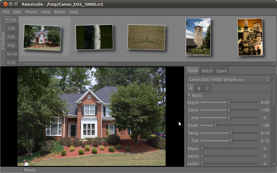
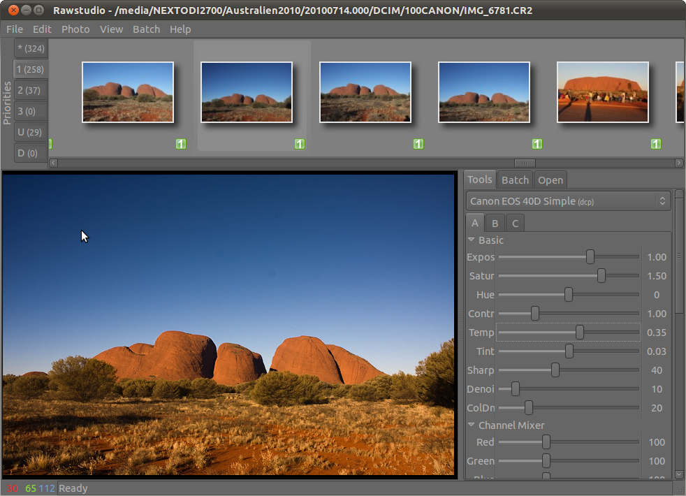
A while ago, I were working a bit on making some eyecandy for the thumbnails in Rawstudio. This were put away again, but a few days ago I picked the old code up and made it work with the current Rawstudio. I have added a border to the thumbnails given them a drop shadow. Here is what it currently looks like:
During all this, I’ve also tested a bit of random rotation of the thumbnails to make them look a bit more “disorganized”. This has caused some mixed reactions, but it sure would be nice to have a few comments from our users on this – do you like it?

This screenshot is a few days old, but I hope you get the point :)

Definite thumbs up on the first image and down on the second.
Why do you have a dark, neutral background in most creative apps instead of something light bright yellow or greem? To keep the focus on the creation (in this case images) itself. It’s the images that are the what users want to pay attention to in an app like this, not the interface.
The rotation captures attention, but remember, everything that captures attention takes it away from somewhere else. In this case it distracts from the actual photo’s themselves and the clarity of the interface.
On the other hand, the rest of the app looks beautiful. Soft shades of grey that avoid high contrast with clean lines and layout. The borders and shadow help to make the distinction clear between the image and the UI, which is a good thing. Nice job all round. Just please drop the jittered thumbnail rotation. :)
If you intend to keep the shadows, at least don’t make them so deep :) And it’s #1 over #2, of course.
The border and drop shadow is a great addition.
I think the rotation will become annoying in the long run. I does look good, but I think the effect will be too distracting to look at after a while.
I like the border and greater distance between thumbnails. The thumbnail lineup looks a lot less cluttered now. What rotation of images is concerned I don’t really think that it adds anything, but I doubt that it would detract either, since it’s fairly non-obtrusive.. It’s probably better just to skip that to avoid annoying anyone.
Good work!
They look great! I prefer #1, and I think it looks cleaner than the random rotation ones. But I definitely like the addition of the border and shadow.
At a first sight the rotation is amazing…but I think it’s not a “professional” feature and it will fit better in other kind of software: what I mean is that I suppose it is just for fun, not for actually working on raw files :-) Anyway…Thanks for the great software you are developing!
Definitely the drop-shadow is nice, but the random rotation is too cutesy for a professional product. As Bugsbane says: “everything that captures attention takes it away”.
I’m tracking the ‘daily’ builds from the Ubuntu PPA repository (on Debian) and really looking forward to a release.
I have quite regular crashing issues at the moment (my version currently does show the eyecandy above), but I’m not sure whether to just file bugs for that sort of thing, or whether there is a better place I can triage the issue first, like an IRC channel or a mailing list or something.
Regards,
Andrew McMillan
No Rotation please! The thumbnails of the first image of rawstudio are good.
-google translation french-english-
“Open” already possible by clicking on “File”
Therefore:
Tools – Corrections – Batch
http://www.heberger-image.fr/images/57083_rawstudiointerface.png.html
-google translation french-english-
Fat square shadows isn’t so good for good appearance. Try to place half-elliptic shadow to the bottom of each photo.